FINAL "KIDS" MUSIC VIDEO
Wednesday, 12 March 2014
Evaluation 4. Media Technologies
In This Prezi, I list and write down all the Media Technologies i use in our video.
Tuesday, 11 March 2014
Evaluation 3. Audience Feedback
In this video I ask different people about Their opinions on the Final Music Video.
Here is some more audience feedback from Social media, such as twitter and Facebook.
Evaluation 2. Compare 3 Different Products
In This Prezi I compare the 3 different media products. My Music video, The Digipak and The Advertisement. I discuss the synergy, similarities and differences in the product.
Evaluation 1. Vlog Between "Real" Media and music video
As you can see here i compare our video to "Real Media". I have added clips of Real Media over the video.
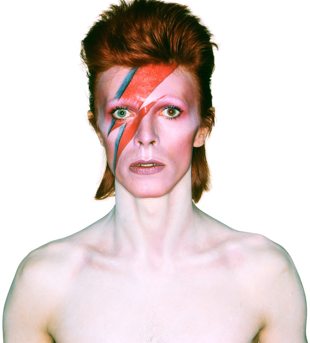
The neon face paint for me was inspired by David Bowie.

as you can see the design for the face paint is inspired by this.
For Me Timelapses are inspired by a "Hyperlapse" video i watch on vimeo
Welcome to London - A Short Hyperlapse Film from Mattia Bicchi Photography on Vimeo.
4. Mock up of the Advertisement

As you can see from the flat plan, poster is following the rough plan and layout. This advert has our album thumbnail at the center of the poster. You would expect to find Adverts like these inside music magazine's such as "Kerrang" or the "Rolling Stones", or even lifestyle magazines. The advert is very simple yet eye catching and colourful, which will please the audience.
3. The Flat Plan of the Advertisment

This is a very rough flat plan of the advert i am going to create for our song "Kids" by "MGMT". The background image is going to the legs and the boots of the "Mother Figure" from my music video. I will be adding the logo of the production company and a bar-code so that it looks more like an Advertisement.
2. Copy a Music Advert
Here is the original poster for Labrinth's Gig in the garden.

Here is the one i recreated using Photoshop.

First thing i did, was find the picture of Labrinth used in the original poster. Once i did i used www.whatthefont.com to find a similar font used in the original poster. You submit a picture of the font you want to find at whatthefont, and it find the closest matching font. I went into a lot of depth and detail to create this advert.
Here is some proof that i actually remade this poster myself.

Here is the one i recreated using Photoshop.

First thing i did, was find the picture of Labrinth used in the original poster. Once i did i used www.whatthefont.com to find a similar font used in the original poster. You submit a picture of the font you want to find at whatthefont, and it find the closest matching font. I went into a lot of depth and detail to create this advert.
Here is some proof that i actually remade this poster myself.
1. Album Advert
This is the song i have chosen, "Sweet Disposition" by "The Temper Trap". i have researched different ways they have advertised this song. Wikipedia says..."Sweet Disposition" was used in a TV ad for Chrysler and Diet Coke in 2010 and for Center Parcs in 2011, "At World's End". The song also features in a commercial for Sky Sports football featuring José Mourinho for Sky Sports HD in the UK, in the commercial for Channel 4's coverage of the V Festival on 4Music, in the commercial for Peugeot 3008 in Scandinavia, and was also used on Sky's cricket coverage for an end of international season video, as well as the promo for the AFL Grand Final on Channel Ten in Australia. In Ireland, the telecommunication company O2 have used the song as part of their recent advertising campaign. The song is featured in a Rhapsody Music commercial, remixed by Axwell and Dirty South, and was also used in a Diet Coke commercial. It has also been used in Television New Zealand (TVNZ) upcoming programme promotions for the year 2010. And recently it also been used in Toyota Yaris TV commercial in Indonesia. It was also used in a 2010 Lifetime advertisement and a TV spot for the film Eat, Pray, Love. It was also used in a commercial for TV5, promoting their Philippine coverage of the Earth Hour 2011. In 2013 it was used in an TV ad for Google's Nexus 10 tablet.
The song we used for our music video, "Kids" by "MGMT" is within the same genre (indie pop), and the song has very similar style.

-484936.jpg)
The song we used for our music video, "Kids" by "MGMT" is within the same genre (indie pop), and the song has very similar style.

-484936.jpg)
Wednesday, 5 February 2014
Ancillary 8,10,11. Digipak
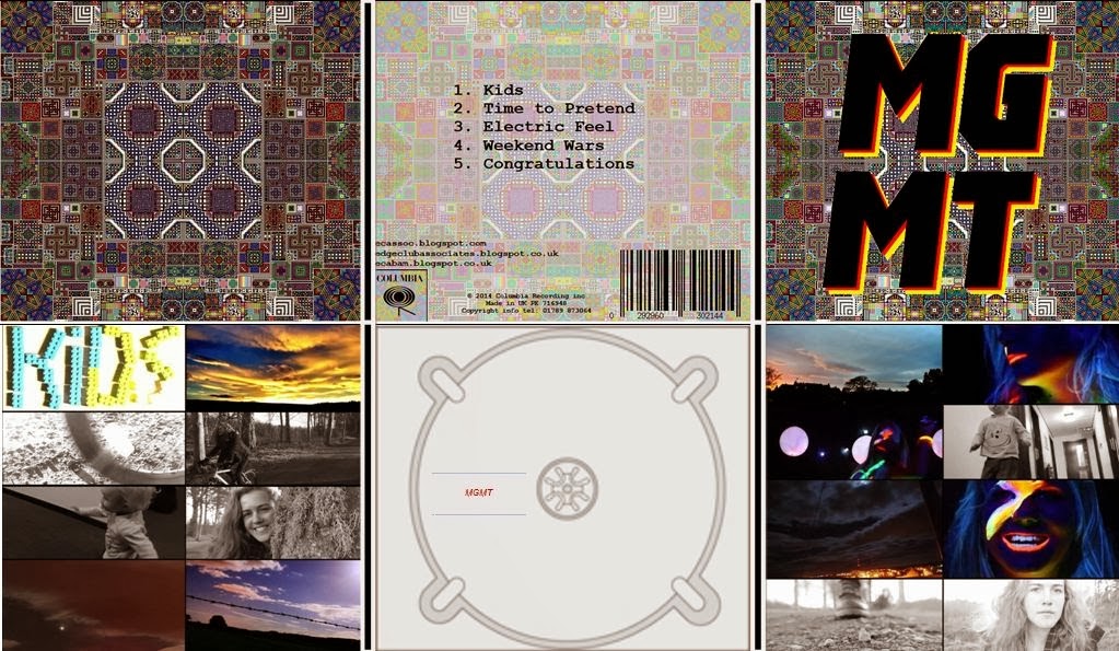
Here is our Final Digipak. As you can see the whole Digipak has a lot of synergy to our final edit of our video.
Ancillary 5. Remake Of Digipak
I looked through Google for different digipak's and i found one that would be interesting to remake. The digipak Below, is Bastille's " Bad blood".
I started by using this Stock image of a County road. I added effect layers over it to reduce the brightness/ contrast/saturation and etc to change the setting from day to night. I used a picture of a moon at night and used that picture to replace the sky in the background. I used a stocky image of a man running and added it onto the picture so far. I also downloaded the font used in the front and back covers to create something similar but not identical to the Digipak covers. As you can see in the original Cover, there is a focus of light, almost like a spotlight, resulting in a circular dark border around the edges of the album. I rendered it and added Lighting effects, and a 2'o clock spotlight, so that it would give a similar effect.
For the back of our cover, i used this picture of this BMW facing forwards, and the same country road stock image to create something similar to the original. I rendered it to add optical flares and used lighting effect to create fake headlights. I used the same font to create the tracklist, and added a random barcode on it.
I also created a middle section of the Digipak by using this image of a Ford Mustang. I used the clone stamp tool to erase the person in the background.
Thursday, 30 January 2014
Tuesday, 21 January 2014
Ancillary 4: Digipak rules
.png)
This is the front cover to our digipak. As you can see it relates strongly to the feeling that we have portrayed in our video. Like in the video, we have used many bright colours, we have also tried to show the wacky feeling in the cover. I feel the this cover goes strongly with the with the video.
The rest of the digipak will contain photographs from sections of the film. These photographs will be edited in a way that makes sure they keep up the synergy with the wacky front cover.
The above font (pulp fiction) goes well with the other fonts that we have carefully picked for the rest of the digipak, we shall also make sure that the colours come across the same.
Ancillary 2: Fonts
MGMT
|
Basic sans sf
|
MGMT
|
Greyhound sf
|
MGMT
|
Pulp Fiction
|
MGMT
|
Stylistic SF
|
MGMT |
Courier new
|
MGMT
|
AR BONNIE
|
MGMT
|
Garamond
|
MGMT
|
Pulp Fiction
|
MGMT
|
Courier New
|
MGMT
|
Garamond
|
Why I have picked the fonts that I have:
I have chosen these fonts as I find they are particularly memorable, this is exactly what I want as I want people to remember my music video. They also have something a bit fun about which makes them more of a pleasure to read. The front cover is going to have the font "Pulp Fiction" this is because it is so big and bold with it's sharp corners to symbolize the simplicity that we are trying to portray when someone views it.
Ancillary 1. Digipack Cover

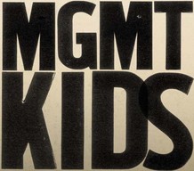
Above is the current digipak cover for Kids by MGMT.
As you can see it is very simplistic, and has a slight old school feel to it. The writing looks like it could be a shot from an old news paper as some of the black in it is patchy. It is big and clear, yet has a rustic feel to it.

The above image is the front cover to there latest 2013 album. As you can see, they have used a more different approach and gone for a happier more chilled out feel. It is certainly less in your face than the art work for "MGMT Kids", as shown above.
Saturday, 18 January 2014
Subscribe to:
Comments (Atom)


.jpg)


